Art, On the Wall
The canvas of the people.
It's everywhere.
But what does it mean?
Tulsans seem to have a growing sense of entitlement to deface other people's property, but the products of these efforts are often interesting and frequently artistic.
POLITICAL COMMENTARY
Let's start with politics since there is so little of it.

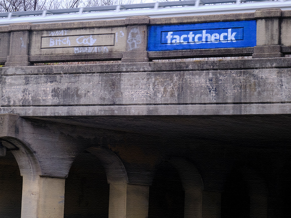
This appears to be a critique of Facebook and the factualness of the material published on Facebook. It is really a well done parody of the Facebook logo. One of the impressive things about it is the skill with which it has been done. It took some acrobatics to place it on the viaduct.

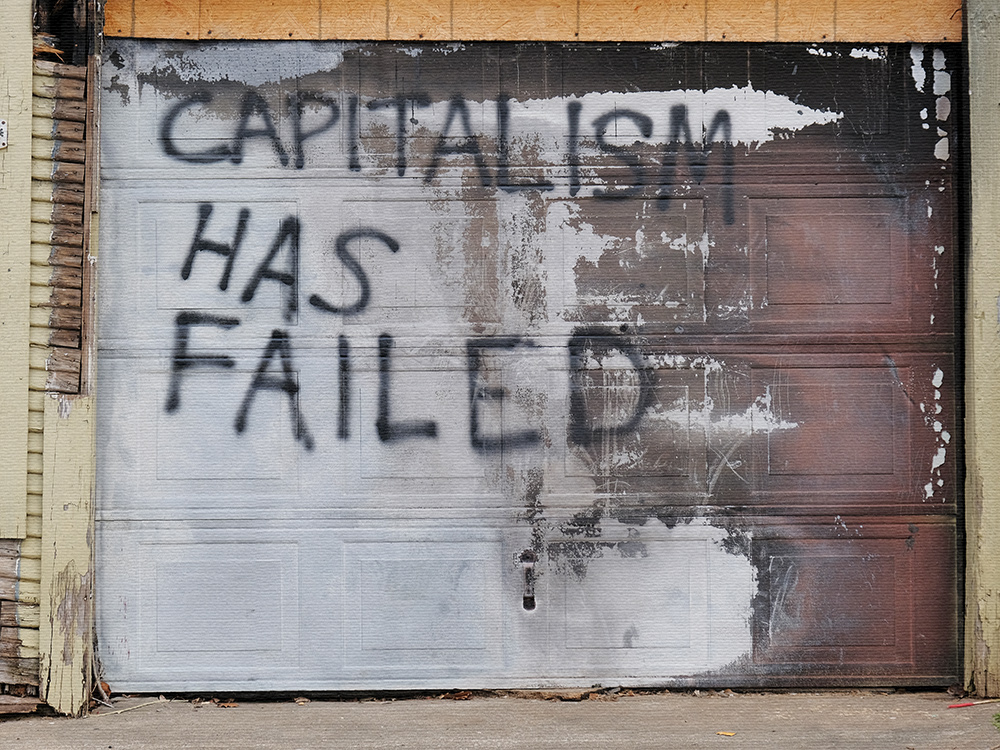
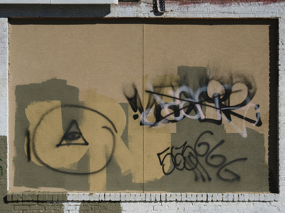
This graffiti was spray painted on a garage door facing Carthage Street, behind the QuickTrip at 15th and Denver. The area behind the QuickTrip is a hangout for homeless people. It is hard to image that anyone painted it for the benefit of the homeless who would see it, so it must have been painted by a homeless person.

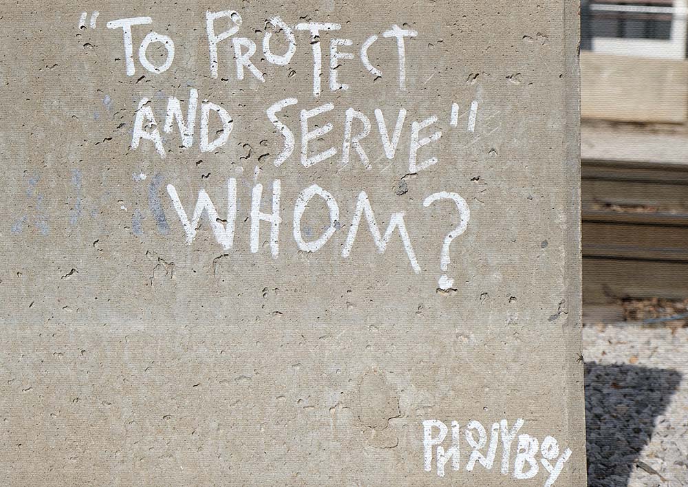
This is one of the most fascinating and intriguing pieces of graffiti to be found around the city. It is hand-painted, not stenciled, on a concrete barrier by the railroad tracks leading to the Arts District. The graffiti is signed by "Ponyboy", a character in S. E. Hinton's book "The Outsiders", so there must be some meaning to this literary reference. "To protect and serve" is the motto of the Tulsa Police Department, so the message is meant to be a commentary on the police in Tulsa. The critique is subtle, however. The most intriguing thing to me about this graffiti is the careful attention given to grammatical correctness, not something we expect to see in street graffiti. The design of the lettering is also quite artistic and carefully done.
ART & DESIGN
Now that we have reviewed our very few examples of political graffiti in Tulsa, let's move on to the beauty of art...

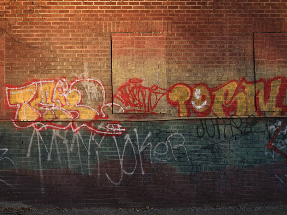
This photo was taken late in the day and the setting sun combined with the colors of the bricks and the colors of the paints have all come together to create a warm palette of rich shades.

Most of the graffiti in Tulsa, or at least a very large part of of the best of it, is found north of Admiral Street. The camera gives a richness to these colors, and certainly the design itself is spectacular. This work, as with many of the better graffitis, appears to have been painted with the knowledge and approval of the property owner.

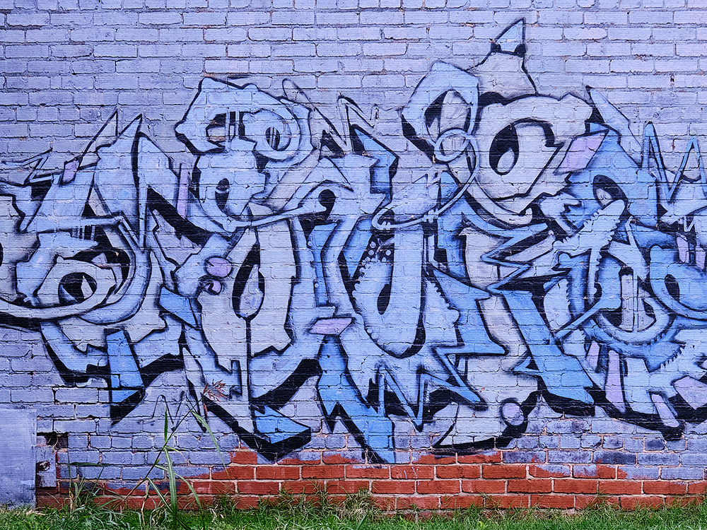
This example incorporates a complexity of design that require careful preplanning. As we will observe with other examples of graffiti, it is fascinating to see how the colors of the surrounding ambiance (the color of the grass and the color of the bricks) combine with the colors of the graffiti itself in a way that is complementary.

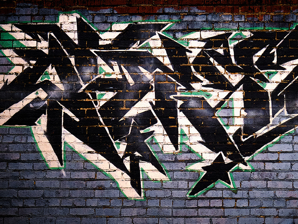
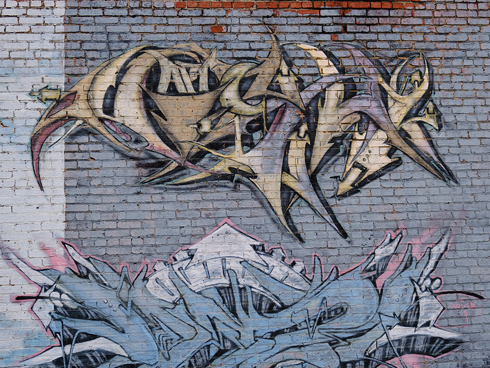
These are more examples of complex design.

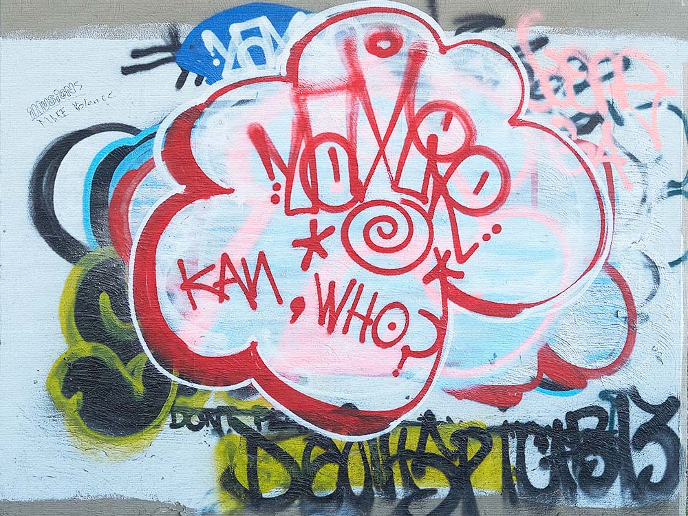
This one does not appear to be a carefully planned composition, but nevertheless it really does work together in a balanced way.

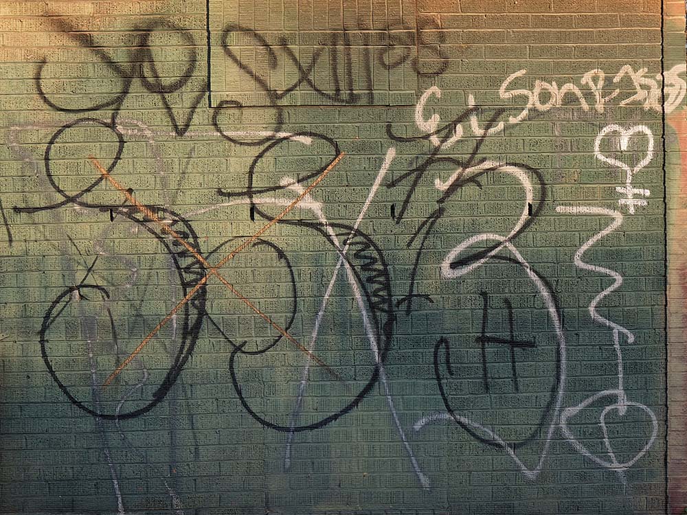
This work is further down on the same wall with the first of the graffitis in the non-political category. What is especially notable here is the fact that it is in Spanish: "El Sonrisas" ...in this case, apparently, a nickname of a male. (It must be a kind of latino slang name.)

It is hard not to be taken in by the exuberance and bright colors of this work near Greenwood.

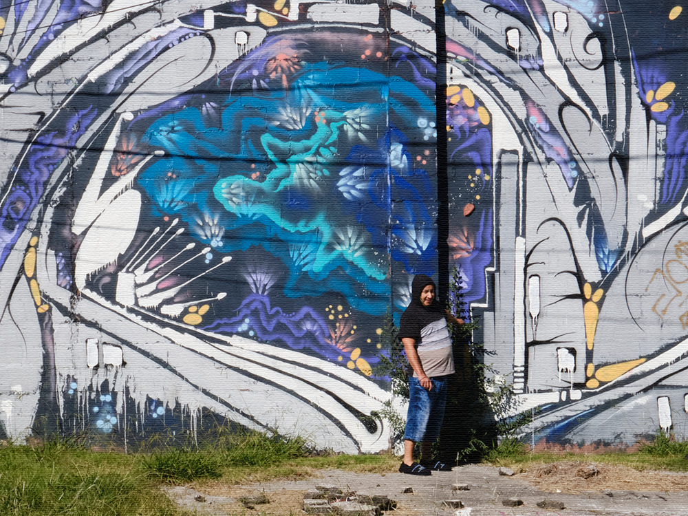
This design covers most of the side of a building and is a salute back to the psychedelic 60s. The nice gentleman posing in the picture was walking down the street when I was photographing and he kindly agreed to pose to give some scale to the size of the art. He also offered to share a smoke with me, but I declined. The mural can be found on North Utica near Pine.

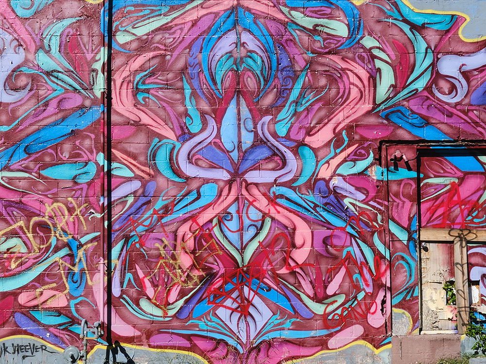
This is a nearby companion to the psychedelic mural above. This one is a puzzle as you look for the door to the building that is hidden inside of the design.

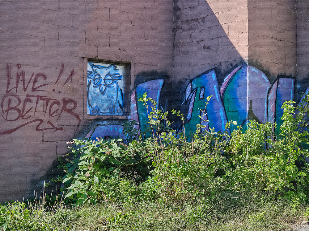
Darn! We missed it! Instructions for how to "Live Better" have been painted on the wall for us all to see, but the weeds have grown so high that the instructions can't be read. Shall we return in the winter when the weeds have died down?

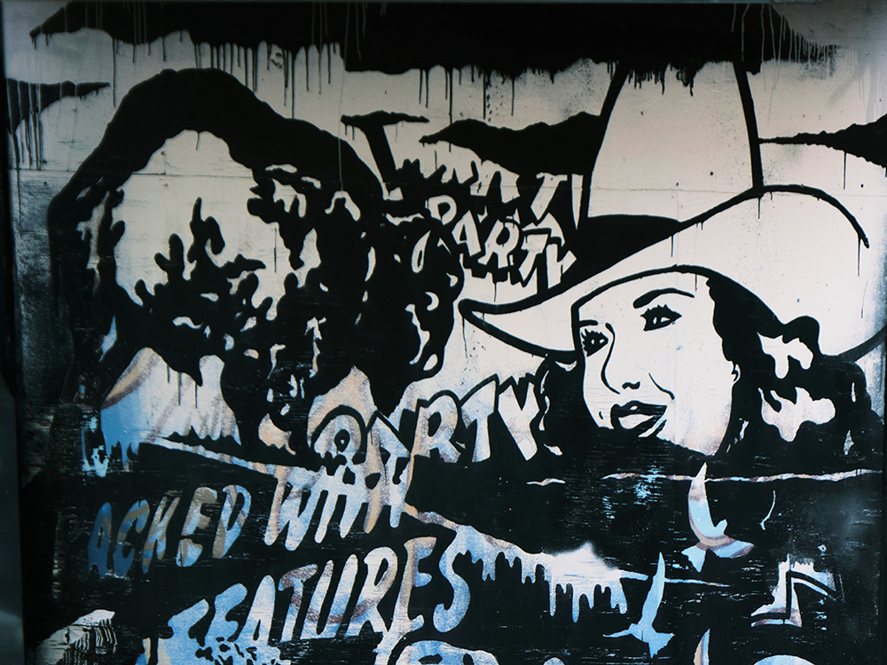
This design is found downtown in the Arts District, and begins to take us back to a more realistic depiction of representational reality.
BACK TO THE REAL WORLD
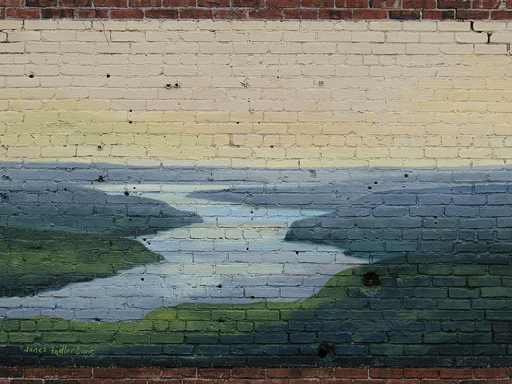
Driving home after photographing some of the examples of graffiti shown on this page, it was quite nice to come across this old fashioned representational wall art. The other works may excite the spirit, but this one calms the soul.

Janet Fadler Davie is the Tulsa artist who did this mural.
Thank you, Janet! You have brought beauty to our day.
The photos on this page are © Rodger Randle .
